Having joined the assessment analytics working group for Moodle Moot AU this year, I thought I’d have a play around with the feedback event data and it’s relation to future assignments. The simplified assumption to explore is that learners who view their feedback are enabled to perform better in subsequent assignments, which may be a reduction of potentially more complex distance travelled style analytics. To get started exploring the data I have produced a simple timeline that shows the frequency of assignment views within a course based on the following identified status of the submission:
- Pre-submission includes activities when the learner is preparing a submission
- Submitted includes views after submission but before receiving feedback (possibly anxious about results)
- Graded includes feedback views once the assignment is graded
- Resubmission includes activities that involve the learner resubmitting work if allowed
The process I undertook was to sort the log data into user sequences and use a function to set the status based on preceding events. For example, once the grade is released then count subsequent views as ‘graded’. This gives an idea of the spread and frequency of assignment engagement.
Timeline
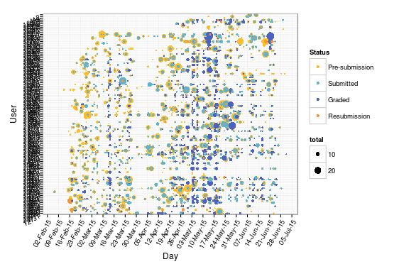
The timeline uses days on the x-axis and users on the y-axis. Each point plotted represents when events were logged for each learner – coloured by the status and sized according to the frequency on that day. There are a few noticeable vertical blue lines which correspond to feedback release dates (i.e. many learners view feedback immediately on its release) and you start to get an idea that some learners view feedback much more than others. The pattern of yellow points reveal learners who begin preparing for their assignment early, contrasted with those who cram a lot of activity closer to deadlines. I have zoomed into a subset of the learners below to help show this.
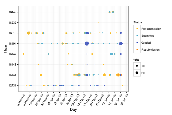
Having put this together quickly I am hoping I will have some time to refine the visualisation to better identify some of the relationships between assignments. I could also bring in some data from the assignment tables to enrich this having limited myself just to event data in the logs thus far. Some vertical bars showing deadlines, for example, might be helpful, or timelines for individual users with assignments on the y-axis to see how often users return to previous feedback across assignments as shown below. Here you can see the very distinct line of a feedback release, which for formative assessment it may have been better learning design to release feedback more regularly and closer to the submission.

How to guide
The following shares the code used to produce the above visualisations and should work with recent Moodle versions.
Step 1: Data Extraction
This uses the logstore data from the initial Moodle database query in the initial log analysis. You can also do this with a CSV file of the logs downloaded from the Moodle interface although some columns may be named or formatted differently and need tidying up.
Step 2: Data Wrangling
Load the libraries, files and set up the time series on events as before discussed in detail earlier.
library(ggplot2)
require(scales)
library(dplyr)
library(tidyr)
library(magrittr)
library(RColorBrewer)
library(GGally)
library(zoo)
library(igraph)
library(devtools)
require(indicoio)
library(tm)

setwd("/home/james/infiniter/data")
mdl_log = read.csv(file = "mdl_logstore_standard_log.csv", header = TRUE, sep = ",")

### Create a POSIX time from timestamp
mdl_log$time <- as.POSIXlt(mdl_log$timecreated, tz = "Australia/Sydney", origin="1970-01-01")
mdl_log$day <- mdl_log$time$mday
mdl_log$month <- mdl_log$time$mon+1 # month of year (zero-indexed)
mdl_log$year <- mdl_log$time$year+1900 # years since 1900
mdl_log$hour <- mdl_log$time$hour
mdl_log$date <- as.Date(mdl_log$DateTime)
mdl_log$week <- format(mdl_log$date, '%Y-%U')

#mdl_log$dts <- strptime(mdl_log$date)
mdl_log$dts <- as.POSIXct(mdl_log$date)

mdl_log$dts_str <- interaction(mdl_log$day,mdl_log$month,mdl_log$year,mdl_log$hour,sep='_')
mdl_log$dts_hour <- strptime(mdl_log$dts_str, "%d_%m_%Y_%H")
mdl_log$dts_hour <- as.POSIXct(mdl_log$dts_hour)
Create a data frame for analysing sequence. In order to maintain the learner centric view of the data this manipulates the userid and relateduserid fields to create a new realuser field that associates the grading event with the learner rather than the teacher so we know where it fits into the learner’s sequence of events. The data is then ordered by learner and assignment so that we can look for changes in the sequence with flags for when the user or assignment id has changed to indicate that the status should be reset.
a_log2015 <- tbl_df(mdl_2015) %>%
mutate(time = as.POSIXct(time)) %>%
mutate(relateduserid = as.integer(levels(relateduserid))[relateduserid]) %>%
mutate(eventname = as.character(levels(eventname))[eventname]) %>%
filter(component == 'mod_assign') %>%
mutate(realuser = ifelse(is.na(relateduserid), userid,
ifelse(eventname=='\\mod_assign\\event\\submission_graded', relateduserid,
userid))) %>%
arrange(realuser, contextinstanceid, time) %>%
mutate(userchange = ifelse(abs(realuser - lag(realuser)) == 0, 0, 1)) %>%
mutate(assignchange = ifelse(abs(contextinstanceid - lag(contextinstanceid)) == 0, 0, 1)) %>%
mutate(userchange = ifelse(is.na(userchange), 1, userchange)) %>%
mutate(assignchange = ifelse(is.na(assignchange), 1, assignchange))
I then created a function that acts like a counter to determine the status.
## Set a status for an assignment.
# 0 = not submitted
# 1 = submitted
# 2 = graded
# 3 = resubmission
init.assignStatus <- function(){
 x <- 0
 function(eventname, assignnew=FALSE) {
 if(assignnew) {
 x <<- 0
 x
 } else if(eventname=='\\mod_assign\\event\\assessable_submitted') {
 x <<- 1
 x
 } else if(eventname=='\\mod_assign\\event\\submission_graded') {
 x <<- 2
 x
 } else if(eventname=='\\mod_assign\\event\\submission_form_viewed' & x>0) {
 x <<- 3
 x
 } else {
 x
 }
 }
}
Then process the logs using this function to set the status.
a_log2015 %<>% rowwise() %>%
 mutate(status = ifelse(userchange>0, assignStatus1(eventname, TRUE),
 ifelse(assignchange>0, assignStatus1(eventname, TRUE),
 assignStatus1(eventname))))
Rather than work with the entire dataset I drilled down into a specific course and analysed this. Change this to whatever course you are interested
science <- a_log2015 %>% filter(courseid == 157)
I filtered my data to just show students, which can be done by identifying teachers to filter out manually or by including roles in the data extraction. At this point I tidied up a few variable types for improved visualisation.
#Filter out staff.
students <- (science %>%
  filter(!(userid %in% c(2,16123)))$userid

science %<>% filter(realuser %in% students) %>%
 mutate(status = as.factor(status)) %>%
 mutate(realuser = as.factor(realuser))
Finally summarise by user, day and status and count the frequency of events for each group.
sci_summary <- science %>%
group_by(realuser, dts, status) %>%
summarise(total = n())
Step 3: Data Visualisation
Finally we are ready to plot the timeline graph.
ggplot(sci_summary, aes(x=dts, color=status)) +
theme_bw() +
geom_point(aes(y=realuser, size=total)) +
scale_x_datetime(breaks = date_breaks("1 week"),
minor_breaks = date_breaks("1 day"),
labels = date_format("%d-%b-%y")) +
scale_colour_manual(name = 'Status',
values = c('#FABE2E', '#60B3CE', '#4D61C0', '#FA962E'),
labels = c('Pre-submission', 'Submitted', 'Graded', 'Resubmission')) +
theme(axis.text.x = element_text(angle = 60, hjust = 1),
axis.text.y = element_text(angle = 30, vjust = 1)) +
labs(x="Day", y="User")
And to plot the same for an individual
sci_16210 <- science %>% filter(userid==16210)

summary_16210 <- sci_16210 %>%
 group_by(contextinstanceid, dts, status) %>%
 summarise(total = n())

ggplot(summary_16210, aes(x=dts, color=status)) +
 theme_bw() +
 geom_point(aes(y=contextinstanceid, size=total)) +
 scale_x_datetime(breaks = date_breaks("1 week"),
 minor_breaks = date_breaks("1 day"),
 labels = date_format("%d-%b-%y")) +
 scale_colour_manual(name = 'Status',
 values = c('#FABE2E', '#60B3CE', '#4D61C0', '#FA962E'),
 labels = c('Pre-submission', 'Submitted', 'Graded', 'Resubmission')) +
 theme(axis.text.x = element_text(angle = 60, hjust = 1),
 axis.text.y = element_text(angle = 30, vjust = 1)) +
 labs(x="Day", y="Assignment")

Pingback: Assignment engagement timeline - starting with ...