Understanding which courses use which tools is a useful starting point for exploration and may be informative to staff development programs or used in conjunction with course observations. The Moodle Guide for Teachers, for example, could be used to help form an understanding of the tools in question. I’m interested in the exploration side, having started a new project in the last week with some former colleagues. We’re exploring what can be learned from learner data and so if I know where different types of activity are happening then I can drill-down into these areas.
I’m using an idea I picked up from Flowing Data to create a heat map of tool use in a Moodle LMS by category. The heat map visualisation site nicely with the existing tool guide so seems a good approach. The Moodle site has been recently upgraded and so the dataset has old style logs (mdl_log) and new style logs (mdl_logstore_standard_log) so the data extraction and wrangling has to account for both formats. Then it is a case of manipulating the data into the heat map format.
Heat Map
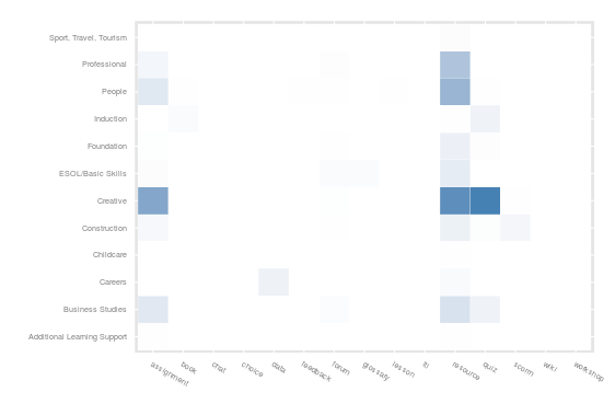
I’ve focused on learner activity within each type of tool rather than the number of tools in a course. The intention is to show the distribution of learner activity. It shows clearly the dominance of resource and assessment type tools, as well as some pockets of communication and collaboration. In this instance the values are skewed by the large number of resource based activities and the dominance of a single department in terms of activity numbers, which can be seen in the bar chart below. However, the technique can be applied to comparing courses within a department or comparing users within a course, which may share more similar scales.

How to guide
The following shares the code used to produce the above visualisations and should work with recent Moodle versions.
Step 1: Data Extraction
As mentioned this uses query that can extract equivalent data from the old and then new logstore data using a union. There are 4 levels to the category hierarchy in the system which is reflected in the 4 levels of category extraction – you can increase or decrease this and clean up categories later if the Moodle structure is not tidy. Note the regular expression in the where statement which is used to filter for students only who have an 8 digit username – you may need to tweak this to your own rules or ignore this line if you want to include staff users as well.
SELECT u.username, u.idnumber AS uid, t4.name AS lev1, t3.name as lev2, t2.name as lev3, t1.name as lev4, c.fullname, c.idnumber AS cid, FROM_UNIXTIME(l.time) as DateTime, l.time as timecreated, CONCAT(l.module, '_', l.action) as eventname, l.module as component, l.action
FROM mdl_log l
JOIN mdl_user u ON l.userid = u.id
LEFT JOIN mdl_course c ON l.course = c.id
LEFT JOIN mdl_course_categories AS t1 ON c.category = t1.id
LEFT JOIN mdl_course_categories AS t2 ON t1.parent = t2.id
LEFT JOIN mdl_course_categories AS t3 ON t2.parent = t3.id
LEFT JOIN mdl_course_categories AS t4 ON t3.parent = t4.id
WHERE u.username REGEXP '^[[:digit:]]{8}$'
UNION
SELECT u.username, u.idnumber AS uid, t4.name AS lev1, t3.name as lev2, t2.name as lev3, t1.name as lev4, c.fullname, c.idnumber AS cid, FROM_UNIXTIME(l.timecreated) as DateTime, l.timecreated, l.eventname, l.component, l.action
FROM `mdl_logstore_standard_log` l
JOIN mdl_user u ON l.userid = u.id
LEFT JOIN mdl_course c ON l.courseid = c.id
LEFT JOIN mdl_course_categories AS t1 ON c.category = t1.id
LEFT JOIN mdl_course_categories AS t2 ON t1.parent = t2.id
LEFT JOIN mdl_course_categories AS t3 ON t2.parent = t3.id
LEFT JOIN mdl_course_categories AS t4 ON t3.parent = t4.id
WHERE u.username REGEXP '^[[:digit:]]{8}$'
Step 2: Data Wrangling
Load the libraries, files and set up the time series on events as before and discussed in detail earlier.
library(ggplot2)
require(scales)
library(dplyr)
library(tidyr)
library(magrittr)
library(RColorBrewer)
library(GGally)
library(zoo)
library(igraph)
setwd("/home//james/infiniter/data/")
mdl_log = read.csv(file = "mdl_log.csv", header = TRUE, sep = ",")

cbPalette <- c("#E69F00", "#56B4E9", "#009E73", "#F0E442", "#0072B2", "#D55E00", "#CC79A7")
getPalette = colorRampPalette(brewer.pal(9, "Paired"))

### Create a POSIX time from timestamp
mdl_log$time <- as.POSIXlt(mdl_log$timecreated, tz = "Australia/Sydney", origin="1970-01-01")
mdl_log$day <- mdl_log$time$mday
mdl_log$month <- mdl_log$time$mon+1 # month of year (zero-indexed)
mdl_log$year <- mdl_log$time$year+1900 # years since 1900
mdl_log$hour <- mdl_log$time$hour
mdl_log$date <- as.Date(mdl_log$DateTime)
mdl_log$week <- format(mdl_log$date, '%Y-%U')
mdl_log$mon <- format(mdl_log$date, "%b")

#mdl_log$dts <- strptime(mdl_log$date)
mdl_log$dts <- as.POSIXct(mdl_log$date)

mdl_log$dts_str <- interaction(mdl_log$day,mdl_log$month,mdl_log$year,mdl_log$hour,sep='_')
mdl_log$dts_hour <- strptime(mdl_log$dts_str, "%d_%m_%Y_%H")
mdl_log$dts_hour <- as.POSIXct(mdl_log$dts_hour)
Create a data frame for classification of activity module events in the data. This uses a series of mutates to classify the old and new versions of components as equivalent in the analysis. You can add any third-party modules you support or classify modules in larger clusters (e.g. communication might include chat and forum events).
d <- tbl_df(mdl_log)
d %<>% mutate(time = as.POSIXct(time)) %>%
 mutate(year = as.factor(year)) %>%
 mutate(assignment = ifelse(component %in% c('assign', 'assignment', 'assignsubmission_file', 'assignsubmission_onlinetext', 'mod_assign', 'mod_assignment', 'journal'),1,0)) %>%
 mutate(book = ifelse(component %in% c('book', 'booktool_print', 'mod_book'),1,0)) %>%
 mutate(chat = ifelse(component %in% c('chat', 'mod_chat'),1,0)) %>%
 mutate(choice = ifelse(component %in% c('choice', 'mod_choice'),1,0)) %>%
 mutate(data = ifelse(component %in% c('data', 'mod_data'),1,0)) %>%
 mutate(feedback = ifelse(component %in% c('feedback', 'mod_feedback', 'questionnaire', 'mod_questionnaire'),1,0)) %>%
 mutate(forum = ifelse(component %in% c('forum', 'mod_forum'),1,0)) %>%
 mutate(glossary = ifelse(component %in% c('glossary', 'mod_glossary'),1,0)) %>%
 mutate(lesson = ifelse(component %in% c('lesson', 'mod_lesson'),1,0)) %>%
 mutate(lti = ifelse(component %in% c('lti', 'mod_lti'),1,0)) %>%
 mutate(resource = ifelse(component %in% c('folder', 'mod_folder', 'imscp', 'mod_imscp', 'page', 'mod_page', 'resource', 'mod_resource', 'url', 'mod_url'),1,0)) %>%
 mutate(quiz = ifelse(component %in% c('quiz', 'mod_quiz'),1,0)) %>%
 mutate(scorm = ifelse(component %in% c('scorm', 'mod_scorm'),1,0)) %>%
 mutate(wiki = ifelse(component %in% c('wiki', 'mod_wiki'),1,0)) %>%
 mutate(workshop = ifelse(component %in% c('workshop', 'mod_workshop'),1,0))
You can then group the data to get a count of module use per category. You can replace the lev4 option with different category levels to move up and down the hierarchy. You can also add a filter at this stage to a particular category and group by course (cid), or to a particular course and group by user (uid).
category <- group_by(d, lev4) %>% summarise(
 assignment = sum(assignment),
 book = sum(book),
 chat = sum(chat),
 choice = sum(choice),
 data = sum(data),
 feedback = sum(feedback),
 forum = sum(forum),
 glossary = sum(glossary),
 lesson = sum(lesson),
 lti = sum(lti),
 resource = sum(resource),
 quiz = sum(quiz),
 scorm = sum(scorm),
 wiki = sum(wiki),
 workshop = sum(workshop)
)
At this stage I was unable to apply the gather() function to the grouped data so I exported this to CSV and re-imported as a new data frame. This is also provides an opportunity to manually tidy up the resultant CSV if you want to merge or re-organise categories.
write.csv(category, "categorydata.csv")
mdl_cat = read.csv(file = "categorydata.csv", header = TRUE, sep = ",")
The data can now be gathered (melted) to the format required to follow the instructions in the ggplot heatmap guide. I have adjusted this to use dplyr and tidyr instead but either is fine. I’m not sure where I introduced component X but it isn’t needed and the final data wrangling is to rescale the total values in preparation for the heat map.
mdl_cat.s <- mdl_cat %>% gather(component, total, -lev4) %>%
 filter(component != 'X') %>%
 mutate(rescale=scale(total))
Step 3: Data Visualisation
The data visualisation is taken pretty much as it is presented in the guide, using ggplot geom_tile.
base_size <- 9

ggplot(mdl_cat.s, aes(component, lev4)) +
 geom_tile(aes(fill = rescale), colour = "white") +
 scale_fill_gradient(low = "white", high = "steelblue") +
 theme_grey(base_size = base_size) +
 labs(x = "", y="", scale_y_discrete(expand = c(0, 0))) +
 theme(legend.position = "none", axis.ticks = element_blank(),
 axis.text.x = element_text(size = base_size * 0.8, angle = 330,
 hjust = 0, colour = "grey50"))
And if you want to sanity check with a bar graph to see if different areas dominate the data counts
ggplot(mdl_cat.s, aes(x = lev4, y = total, fill = component)) +
 geom_bar(stat="identity", position="dodge") +
 scale_fill_manual(values = getPalette(15)) +
 labs(x="Component", y="") +
 theme(axis.text.x = element_text(angle = 40, hjust = 1))
